
If you're trying to get more leads from your website, one question matters more than most people realize:
Are you sending visitors to a homepage… or to a landing page?
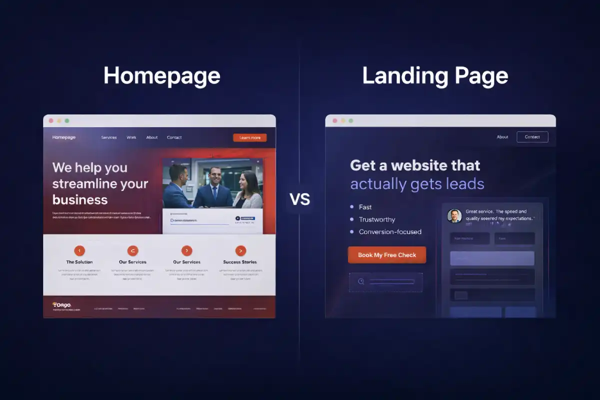
They look similar at first glance. Both have a headline. Both can show services. Both can have a contact button. But they're built for different jobs, and using the wrong one can quietly kill your conversions.
The 10-second answer
A homepage helps people explore. It's a map of your brand: who you are, what you do, and where to go next.
A landing page helps people decide. It's a focused page designed to get one action: book a call, request a quote, download, sign up—whatever your goal is.
What a homepage is designed to do
Your homepage is usually the default destination for:
- People who searched your brand name
- Referrals who want to “check you out”
- Visitors who are unsure what you offer yet
Because of that, a homepage typically includes:
- Navigation (Services, Work, About, Contact, Blog)
- Multiple pathways depending on what the visitor cares about
- Brand + trust content (why you, proof, story)
Conversion note: A homepage can convert, but its primary job is to build trust and guide people to the right next step.
What a landing page is designed to do
A landing page is usually the destination for:
- Ads (Google / Meta / TikTok)
- Cold outreach links
- Email campaigns
- Specific offers (FreeCheck, audits, packages, a promo)
Landing pages remove distractions and increase momentum. That's why many landing pages:
- Limit navigation (or remove it completely)
- Repeat a single main CTA several times
- Answer objections quickly (FAQ, proof, process, guarantees)
Important: A landing page does not have to go to a login. It can go straight to a form, a booking link, a checkout, or a simple “reply to this email” flow, whatever matches your goal.
5 differences that actually matter
1) Goal
Homepage: explore and understand.
Landing page: take one action.
2) Traffic intent
Homepage: mixed intent (many different visitor
types).
Landing page: aligned intent (campaign-specific).
3) Navigation
Homepage: helpful to explore.
Landing page: often reduced to keep focus.
4) Content structure
Homepage: overview + sections.
Landing page: a persuasive sequence: headline → proof
→ offer → objections → CTA.
5) Measurement
Homepage: harder to measure because multiple CTAs
compete.
Landing page: easy to track because one CTA is the
metric.
Which one do you need? Quick checklist
Use a homepage if most of these are true:
- You're building a long-term brand and credibility
- Visitors come from referrals or organic search
- You offer multiple services and people need to browse
- You want a central hub that links everything
Use a landing page if most of these are true:
- You're running ads or sending cold traffic
- You have a single offer (audit, package, booking)
- You want to test and improve conversion quickly
- You need a page that answers objections fast
For service businesses: the best setup is both
For a web studio, the cleanest system is:
- Homepage = trust + overview (your “main hub”).
- Landing pages = focused offers (your “conversion engine”).
Example offers that work well as landing pages:
- Free website conversion check
- Speed + trust audit
- One-page website package
- Fix-only service (no redesign)
If you want a clear flow, read: Two-Step Project Flow. It's an easy way to keep projects predictable and smooth.
Common mistakes (and quick fixes)
- Too many CTAs on a landing page: pick one primary CTA and make everything support it.
- Weak headline: say the outcome + who it's for (not generic “Welcome”).
- No proof: add testimonials, client logos, before/after, or numbers (even small ones).
- Forms that don't deliver: ensure emails don't go to spam (see: Why Contact Forms Go to Spam).
- Slow pages: speed is trust. Start with: Speed Fix Checklist.
A simple “landing page layout” that works
If you want a safe starting template, use this order:
- Headline (clear outcome) + primary CTA
- Problem (what the visitor is struggling with)
- Solution (what you do and how it helps)
- Proof (testimonials / examples / numbers)
- Process (simple 3–5 steps)
- FAQ (objections and pricing expectations)
- Final CTA (repeat the same action)
If you want to see how I review websites in a practical way, here's my checklist: Free Quick Check: What I Check.
Final takeaway
Don't force one page to do every job. Use your homepage to build trust and guide visitors. Use landing pages to convert specific traffic into real leads.
One small change (sending traffic to the right page) can outperform a full redesign.