
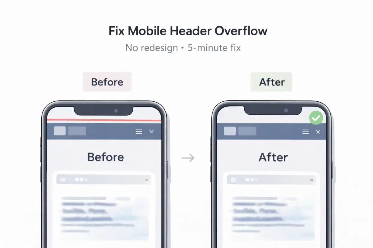
Problem: On mobile, the header/menu spills outside the screen. You get horizontal scroll, clipped buttons, or the “Menu” layout breaks.
Goal: Fix it without redesign, just clean, safe CSS + quick debugging.
Who this is for
- You see a tiny horizontal scroll bar on mobile.
- Header buttons push out of the container.
- Some pages are fine, but specific pages overflow.
Symptoms (what you’ll notice)
- Page can scroll sideways a little.
- Header content looks “shifted” or cropped.
- One long word/URL forces the layout wider.
- Images or SVG logos exceed container width.
Quick test (60 seconds)
- Open DevTools → Toggle device toolbar (mobile).
-
Check if
document.documentElement.scrollWidth > window.innerWidth. - Inspect the header area and look for an element sticking out.
Find the exact offender (fast)
Run this in DevTools Console (only on the broken page):
(() => {
const docW = document.documentElement.clientWidth;
const offenders = [...document.querySelectorAll("body *")]
  .filter(el => {
    const r = el.getBoundingClientRect();
    return r.right > docW + 1 || r.left < -1;
  })
  .map(el => {
    const r = el.getBoundingClientRect();
    return {
      tag: el.tagName.toLowerCase(),
      class: el.className || "",
      left: Math.round(r.left),
      right: Math.round(r.right),
      width: Math.round(r.width)
    };
  });

console.table(offenders);
return offenders;
})();
Usually, it’s one of these:
- Flex child that refuses to shrink
- Long text / long URL / unbroken string
- Image/SVG without
max-width - Absolute positioned element wider than viewport
- Padding + width math without
box-sizing
Fix steps (safe, no redesign)
1) Make flex items shrink properly
If your header uses flex, this one line solves many “overflow” bugs:
/* critical for flex children */
.header * {
  min-width: 0;
}
Better: apply only to the flex child that overflows (logo/title/nav area).
2) Stop long text/URLs from breaking layout
.header, .nav, .menu {
  overflow-wrap: anywhere;
  word-break: break-word;
}
3) Ensure images/SVG never exceed container
img, svg, video, canvas {
  max-width: 100%;
  height: auto;
}
4) Fix the classic “100vw causes overflow” bug
100vw can include scrollbar width. Use this instead:
width: 100%; /* not width: 100vw */5) Temporary containment (use carefully)
If you need a quick safety net while you patch the real issue:
html, body {
  overflow-x: hidden;
}
Note: This hides overflow symptoms, but you should still fix the offending element.
Result (what “good” looks like)
- No horizontal scroll on mobile.
- Header stays aligned across all pages.
- Menu overlay opens centered, with consistent theme.
Want me to fix it for you?
If your website has this bug (or any UI issue), send me the link. I’ll reply with a clear fix plan.
← Back to Affiq LogSupport Independent Work
If my work or articles help you, you can support my independent work here.
Support