
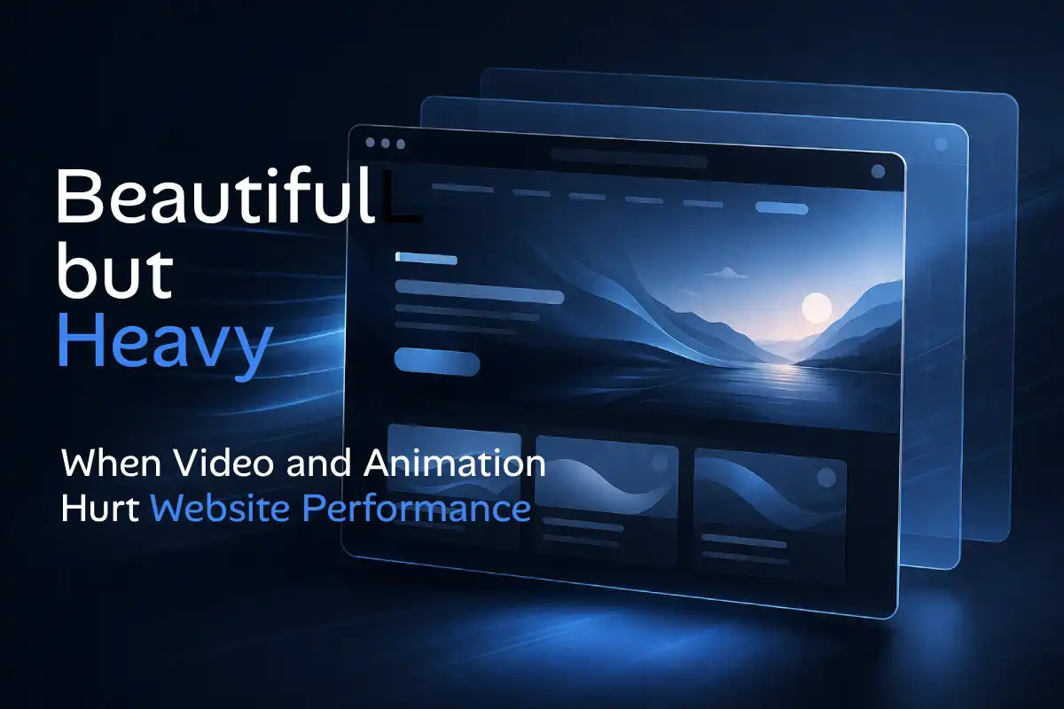
Video and animation can make a website feel polished, modern, and more expensive than it actually is.
A soft background motion, a cinematic hero section, or a smooth reveal effect can create a stronger first impression than static content alone. That is why many websites use motion to look more premium.
But there is a line that gets crossed very quietly. What starts as “beautiful” can become heavy. What feels premium in a design preview can feel slow, distracting, and tiring on a real device, especially on mobile.
This is where performance becomes more than a technical topic. It becomes a clarity problem, a trust problem, and sometimes even a conversion problem.
Why video and animation feel attractive in the first place
Motion naturally pulls attention. A moving background, a looping product clip, or a smooth transition makes a page feel alive. It can suggest care, detail, and a higher-end brand experience.
Used well, motion can support the message. A short product demo can explain a service faster than a paragraph. A subtle hover effect can make interaction feel smoother. A clean reveal can help structure a page without making it feel stiff.
The problem is not motion itself. The problem begins when motion is added because it looks impressive, not because it improves the actual experience.
When beautiful starts becoming heavy
The first danger is that people often judge a website’s speed before the page is fully loaded.
They do not think in technical metrics. They notice whether the first screen appears quickly, whether the text is readable right away, and whether the page feels calm or overloaded.
A large autoplay video or heavy first-screen animation can delay that feeling of readiness. Even if the design is visually impressive, the user may still walk away with a simple conclusion: this site feels slow.
1) Heavy hero video can weaken the first impression
A full-screen hero video is one of the most common examples. It often looks premium in concept, but it can become one of the heaviest things on the page.
The browser still needs to load the video, paint the page, and keep everything moving smoothly while text, buttons, and other assets also compete for attention. That is a lot to ask from the first few seconds.
When this happens, the user does not admire the technical effort. They simply feel delay. The call to action appears later, the message lands slower, and the website feels heavier than it needs to.
2) Too much motion can make the page harder to read
Performance is not only about load speed. It is also about how quickly someone understands what they are looking at.
A website can load fast in a technical sense and still feel mentally slow because too many things are moving. Background effects, parallax sections, autoplay carousels, floating shapes, and repeated reveal animations can make the page feel busy before the message is clear.
This matters because visitors usually do not arrive to admire motion. They arrive to understand something:
- What do you offer?
- Can I trust you?
- What should I click next?
When motion competes with those answers, clarity starts losing.
3) Mobile devices pay the highest price
A website can feel acceptable on a desktop and still perform badly on a phone.
Mobile devices often deal with smaller processors, battery limits, thermal limits, and less forgiving network conditions. That means animation that feels smooth on a laptop can become stuttery on mobile. A background video that looks cinematic on desktop can feel wasteful on a phone.
This is one reason so many websites look “fine” when tested by the creator, but feel worse to real visitors. The site was judged in the most comfortable environment, not in the most realistic one.
4) “Premium” is not the same as “more movement”
Some websites become heavier because they confuse polish with activity. They keep adding motion in the hope that more animation will make the page feel more expensive.
But premium design is usually not about showing more motion. It is about showing more control.
A calm page with one well-placed effect often feels more refined than a page where everything fades, slides, zooms, and loops at once. Controlled motion feels intentional. Too much motion feels restless.
What helpful motion looks like
Motion can still be valuable when it supports understanding instead of stealing focus.
Helpful motion usually feels like this:
- a short demo that explains a product clearly
- a small hover effect that improves interaction feedback
- a gentle reveal that supports reading flow
- subtle animation that does not delay the first screen
Harmful motion usually feels like this:
- autoplay media that dominates the page before the message appears
- animation added to nearly every block without a clear purpose
- effects that look smooth on desktop but struggle on mobile
- motion that makes the page harder to scan, not easier
A simple rule: let the message arrive first
One of the safest ways to judge motion is this: does it help the main message arrive faster, or does it delay it?
If the answer is delay, the effect may be too heavy, too early, or too frequent.
On most business websites, the first screen has a simple job. It needs to communicate trust, relevance, and direction quickly. That usually means text, hierarchy, and one clear next step matter more than a dramatic background effect.
Performance is part of the brand experience
People rarely separate design from performance in their minds. They experience the website as one thing.
So when a page feels heavy, the brand can feel less sharp. When the first screen struggles, the business can feel less prepared. When the motion gets in the way, trust can quietly drop even if the visuals are technically impressive.
That is why performance should not be treated as a final technical cleanup. It is part of the design decision from the beginning.
The better goal
The goal is not to remove all motion. The better goal is to keep the right motion and remove the weight that does not earn its place.
A website can absolutely feel modern, polished, and premium without becoming heavy. In fact, the strongest websites often feel that way because they know when to stay still.
Beautiful design matters. But when video and animation start slowing the message, weakening clarity, or making mobile feel worse, beauty is no longer helping performance. It is fighting it.