
Most websites don’t lose customers because they’re “ugly”. They lose customers because they feel uncertain.
The good news: you don’t need a full redesign to increase trust. Small fixes can instantly remove doubt.
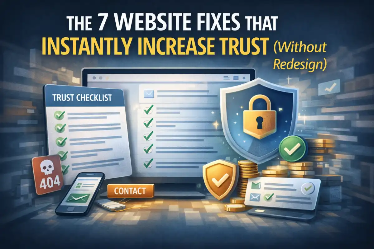
1) Fix broken links and 404 moments
Nothing kills trust faster than clicking something and landing on an error page.
Quick win: check your nav, footer, and primary buttons. Fix or remove dead links.
2) Make mobile layout feel intentional
If your header wraps badly, buttons overlap, or text is cramped, people assume the business is careless.
Quick win: test 375px width (iPhone). Ensure buttons fit and spacing breathes.
3) Your contact path must be obvious
If visitors need to “hunt” for a WhatsApp number or email, they hesitate.
Quick win: show a clear contact button and repeat it near the bottom.
4) Forms must feel safe and clear
When forms have no validation, no success message, or feel buggy, visitors stop.
Quick win: add clear labels, required markers, and a success confirmation.
5) Improve readability (instant premium effect)
Trust increases when text is easy to read: good line-height, spacing, and contrast.
Quick win: increase spacing slightly and avoid tiny grey text.
6) Make buttons consistent (shape, label, behavior)
Inconsistent buttons feel messy. Consistency feels professional.
Quick win: standardize primary vs secondary buttons and keep labels clear.
7) Remove heavy visuals that slow down the first load
A slow website feels unreliable. Speed is trust.
Quick win: compress images (WebP), lazy-load below the fold, and keep the hero light.
Mini trust checklist
- No broken links
- Mobile header doesn’t wrap awkwardly
- Contact button is obvious
- Forms confirm success
- Readable text spacing
- Consistent buttons
- Fast hero load
Bottom line
Trust is mostly friction removal. Fix the small doubts, and conversions improve without a redesign.
If you want a fast audit, I usually start with: broken links → mobile polish → contact clarity → form feedback → speed.